SE7TEROOMS & SUITES
Seaside suites
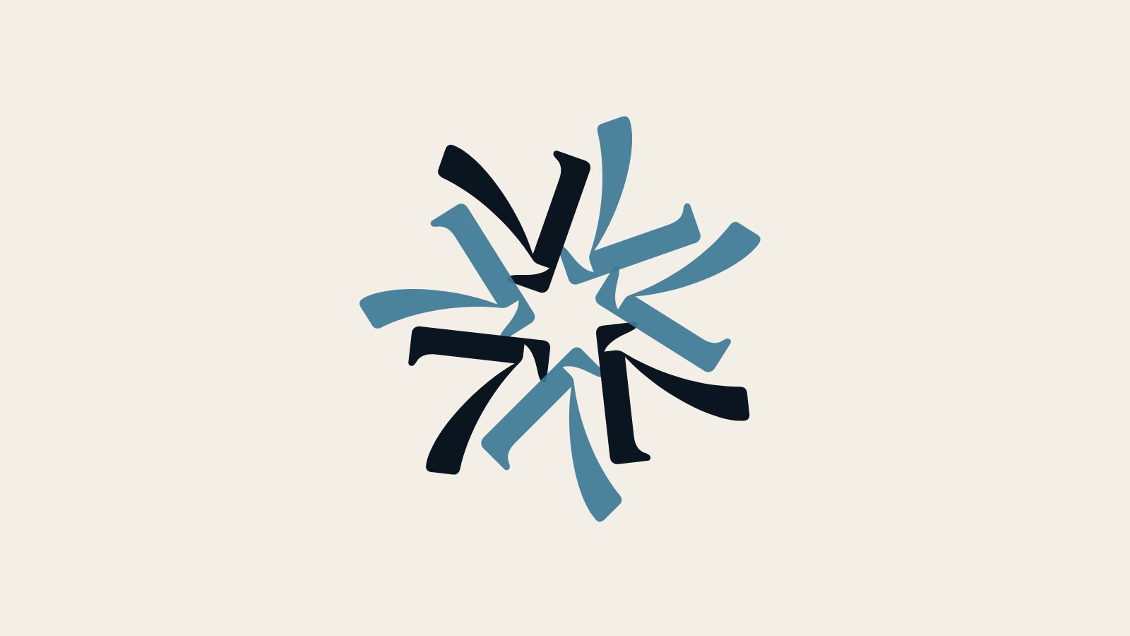
SE7TE Rooms & Suites
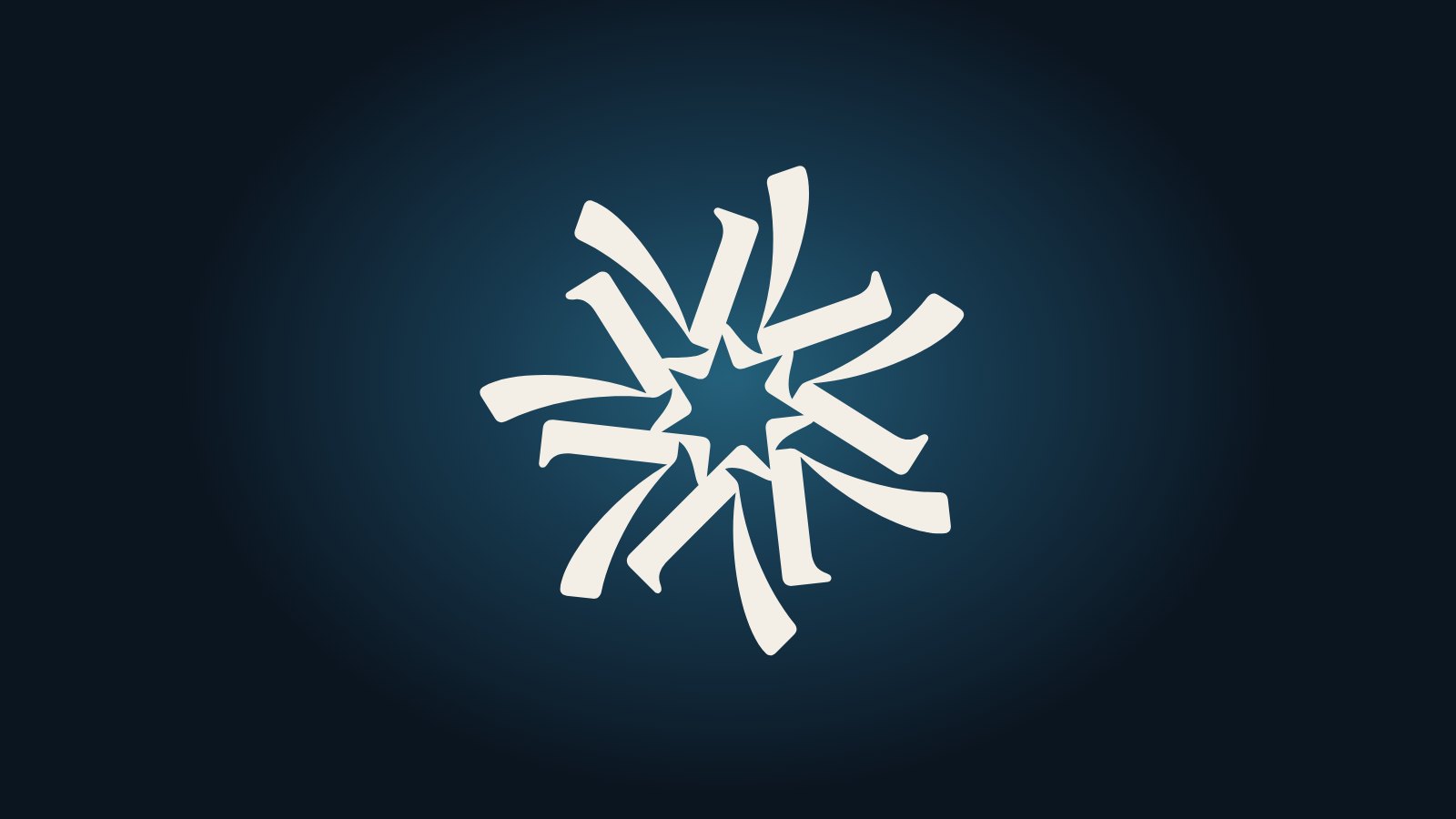
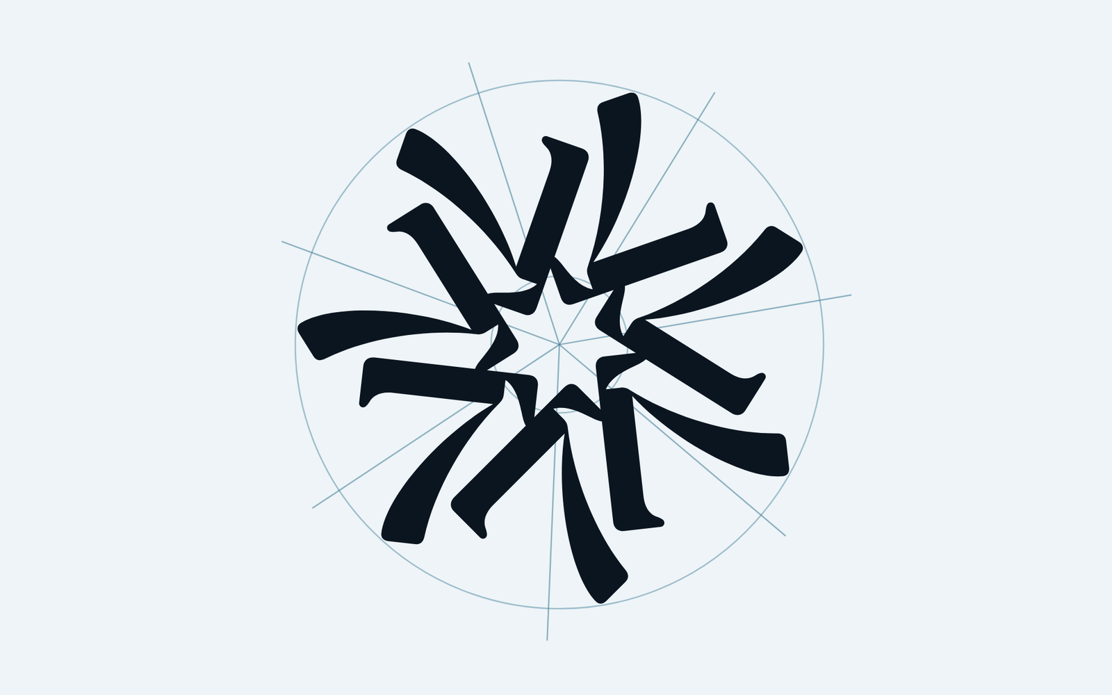
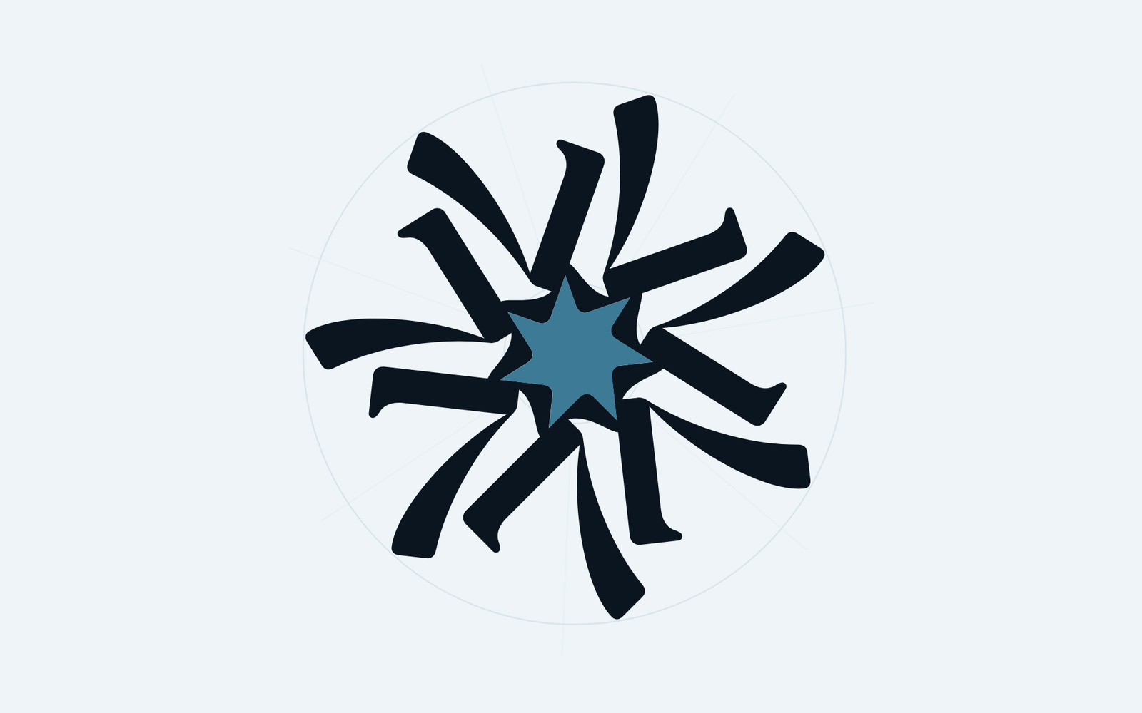
Visual identity for SE7TE, seven suites overlooking the sea in Tropea. The brand grows from a single sign, a custom-drawn 7 repeated seven times around a centre: a symbol that tells the story of the place before you even read its name.
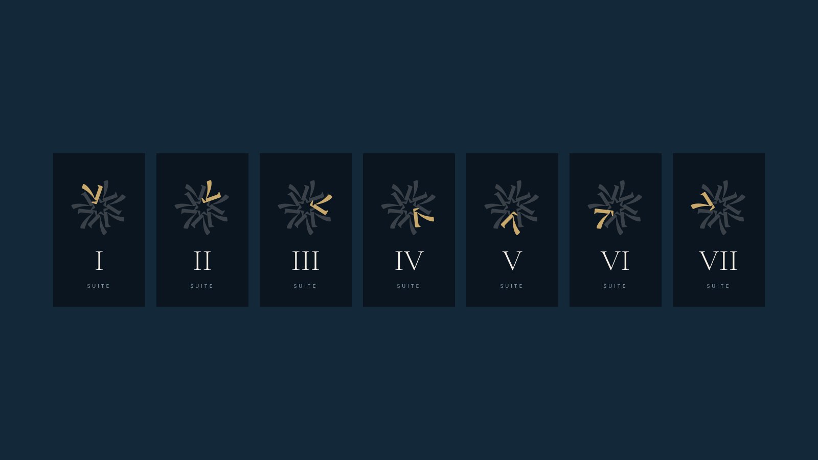
The property has seven suites, numbered I to VII and each one different, in a town where accommodation is plentiful and often hard to tell apart. It needed a boutique hospitality identity, far from seaside clichés, that would work just as well on the room doors as on the web and in print, and that would get the number behind the name across at a glance.
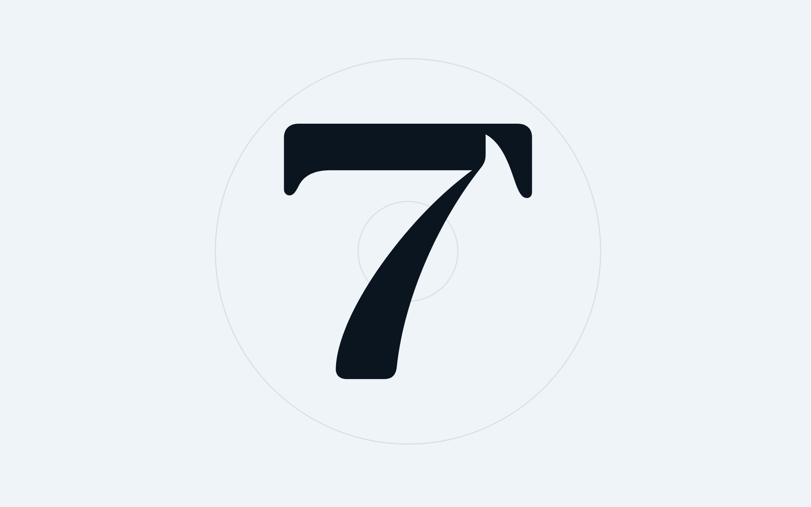
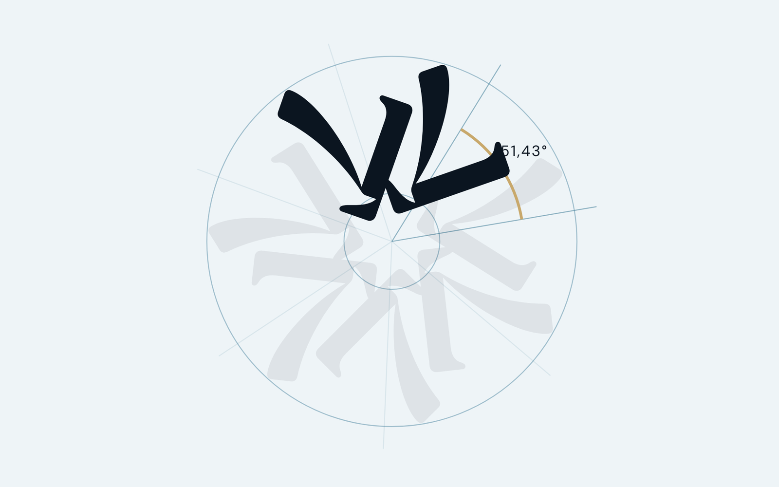
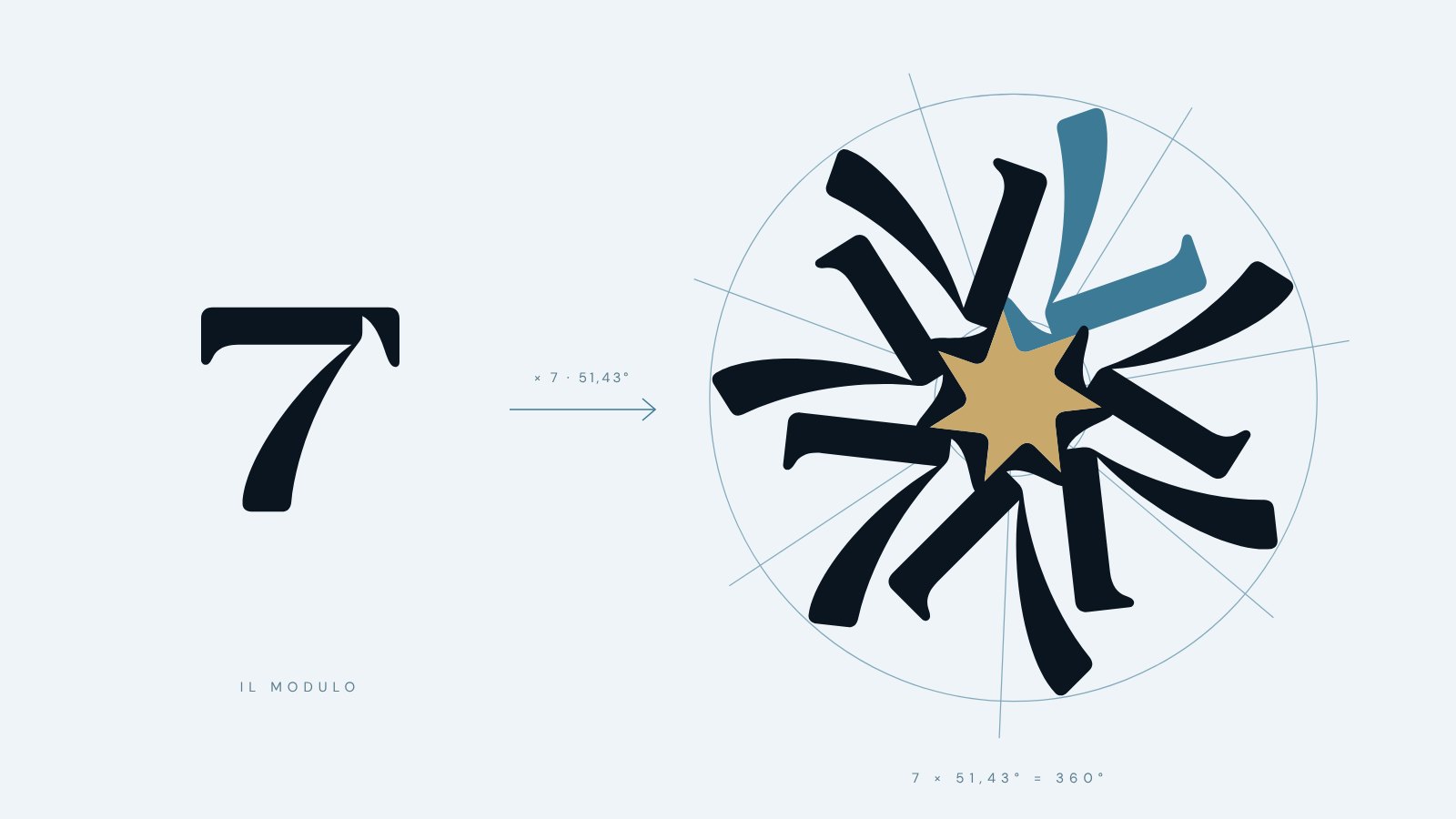
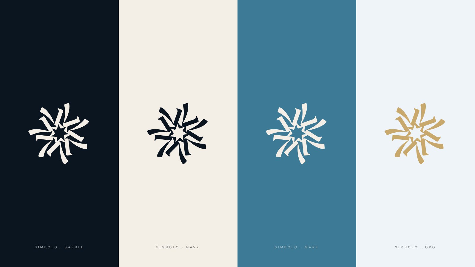
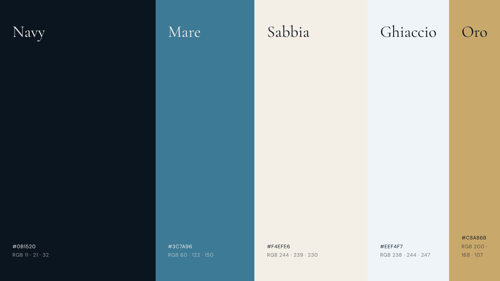
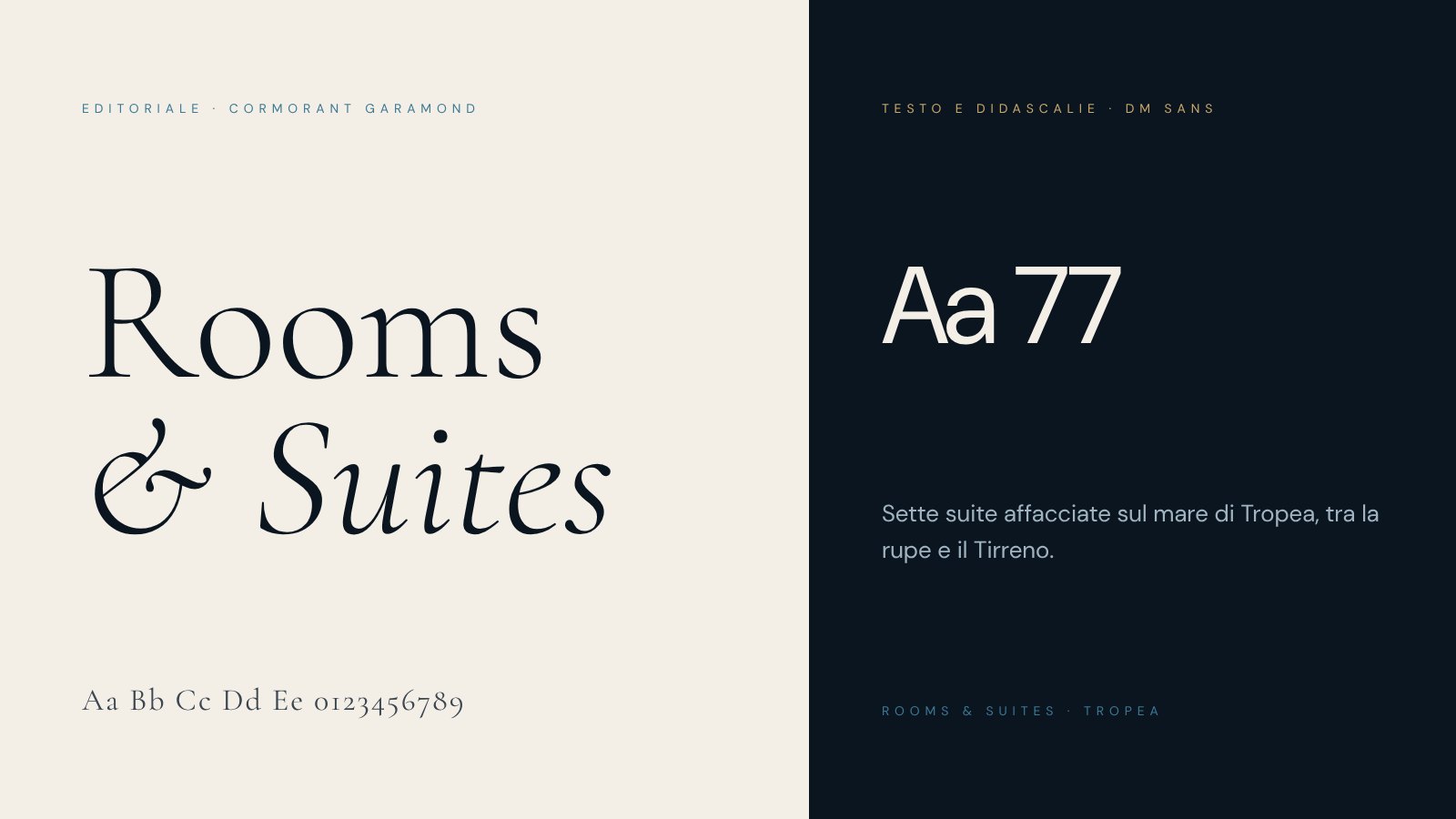
We drew a serif 7, with a double-serifed bar and a curved stem, and made it the only building block of the symbol: turned upside down and repeated seven times at 51.43° steps, each figure hooks onto the next. A seven-pointed star is left empty at the centre, the third 7 in the mark. In the SE7TE wordmark the figure replaces the second T, set in a high-contrast serif. The palette comes from the coast (Navy, Sea, Sand and Ice, with Gold as an accent) and the type pairs Cormorant Garamond with DM Sans. The system reaches the suite door plaques, where a single 7 lights up, a different one for each suite.
- Suites
- Module rotation
- 51.43°
- Palette
- 5 colours
- Applications
- Signage, web, print
“
The best experiences are born when design meets technology worthy of the ideas.